
First impressions in ecommerce happen fast. A shopper who lands on your store decides within seconds whether it feels trustworthy or not. If something looks off — cluttered pages, mismatched colors, or blurry photos — they leave before you ever get a chance to sell. The good news is that a professional-looking store does not require an expensive redesign or a dedicated design team. Small, deliberate upgrades to how your store looks and feels can dramatically shift how shoppers perceive your brand.
Professionalism in ecommerce is a blend of visual consistency, clarity, and usability. This guide walks through the most impactful areas to improve — from your brand identity to your checkout flow — so your store looks credible and earns more buyer confidence at every step.
Build a Consistent Brand Presence Across Every Page
One of the fastest ways to look more professional is to make your store feel cohesive. When logos, colors, and fonts vary from page to page, a store feels assembled rather than intentionally designed.
Define Your Visual Identity
- Logo: Use a single, clean logo consistently across your header, favicon, email templates, and social profiles.
- Color palette: Stick to two or three brand colors. Apply them consistently to buttons, headings, and accents.
- Typography: Choose one or two readable fonts — one for headings, one for body text is sufficient.
- Tone of voice: Keep your language consistent — whether friendly or formal — across product descriptions, policy pages, and customer-facing emails.
When these elements align, even a small independent store looks like an established brand. Shoppers sense that someone deliberate is behind the operation, which builds trust before they read a single product description.
Use Cleaner Layouts That Guide Shoppers Naturally
A cluttered store pushes customers away before they have a chance to buy. Professional stores use whitespace and visual hierarchy to make navigation feel effortless and intuitive.
Reduce Visual Noise
Remove competing banners, overlapping pop-ups, and promotions that fight for attention on the same screen. Every element on a page should serve a clear purpose. If it is not helping the shopper move closer to a purchase, it is worth reconsidering.
Prioritize Mobile Layout
Most shoppers browse on mobile devices. Review your store on a phone and check for:
- Buttons that are large enough to tap comfortably
- Text that is readable without zooming
- Images that load and scale correctly across screen sizes
- Navigation menus that do not overlap or obscure content
A store that works smoothly on mobile immediately feels more professional, because most poorly built stores break down on smaller screens and shoppers notice instantly.
Upgrade Product Pages So They Feel Trustworthy
Your product pages are where purchase decisions are made. Weak product pages — with thin descriptions, inconsistent photos, or unclear pricing — signal an amateurish operation and give shoppers a reason to shop elsewhere.
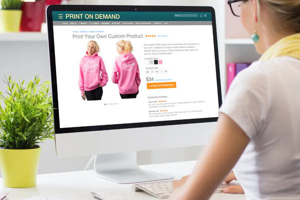
Improve Your Product Photography
You do not need a photography studio, but you do need consistency. Use the same background, lighting style, and angle across all your product images. A mix of clean front-facing shots and lifestyle images serves different buyer needs. Ensure all photos are high resolution and optimized to load quickly.
Write Benefit-Led Descriptions
Lead with what the product does for the customer, not just what it is. Mention key specifications — dimensions, materials, compatibility — but frame them around value. Clear, well-structured copy makes your store feel authoritative and reliable.
Present Pricing Clearly
Avoid hiding fees or using unusual pricing formats. Display the price prominently, show any discounts cleanly, and include shipping cost information as early as possible on the product page so buyers are not surprised at checkout.
Add Trust Signals That Remove Buyer Doubt
Even shoppers who like your products will hesitate if your store does not feel safe to buy from. Trust signals are the specific details that reassure visitors they are making a secure, low-risk purchase.
Key Trust Elements to Include
- Customer reviews: Display ratings and written reviews on product pages. Authentic feedback significantly reduces perceived risk.
- Secure checkout indicators: Show SSL badges, accepted payment method icons, and secure checkout labels near the buy button.
- Clear return and shipping policies: Make these easy to find — link them in the footer and reference them directly on product pages.
- Visible contact details: An email address, live chat option, or phone number tells shoppers a real business is behind the store.
- FAQ section: A short FAQ on product or checkout pages reduces hesitation and unnecessary support requests.
Refine the Checkout and Customer Journey
A professional store does not just look good — it works smoothly from start to finish. Friction in the buying process is one of the most common reasons shoppers abandon their carts, even after they have decided to buy.
Streamline the Path to Purchase
- Offer guest checkout so first-time buyers are not forced to create an account
- Reduce the checkout to as few steps as possible
- Show a clear order summary with product names, quantities, and the total cost including shipping
- Eliminate surprise fees at the final step — transparency keeps buyers from backing out
Page loading speed also matters here. A slow or unresponsive checkout feels unreliable. Compress images, minimize unnecessary scripts, and use a dependable hosting provider to keep your store fast and responsive.
Fix Small Details That Make a Big Visual Difference
Professional stores are consistent at a granular level. These smaller fixes are often overlooked, but shoppers notice them subconsciously and they quietly shape overall perception.
Details Worth Checking
- Grammar and spelling: Errors in product descriptions or policy pages immediately lower credibility.
- Favicon: A branded favicon in the browser tab is a small but visible signal of a store that cares about the details.
- Footer completeness: Include links to your about page, contact information, policies, and social media. A sparse or empty footer looks unfinished.
- Button labels: Use clear, action-oriented labels — Add to Cart, Proceed to Checkout — rather than vague or confusing text.
- Custom 404 page: A branded error page guides lost visitors back into your store instead of leaving them at a dead end.
Focus on Improvements That Support Sales
Not every design upgrade delivers equal impact. When working with limited time or budget, concentrate on changes that most directly affect shopper confidence and purchase decisions rather than purely cosmetic tweaks.
A simple prioritization framework to guide your efforts:
- Fix broken or confusing elements first — anything that makes your store hard to navigate or understand should be addressed immediately
- Improve your product pages — photos and descriptions are what shoppers evaluate most closely before buying
- Add visible trust signals — reviews and clear policies reduce doubt quickly and with minimal effort
- Tighten your brand visuals — consistent logo, colors, and fonts take time to set up but pay off across every page
- Streamline the checkout last — once the store looks and feels credible, checkout optimization closes the sale
A professional-looking online store is not about spending more money — it is about making deliberate, consistent choices. Every visual, every word, and every interaction either adds or removes trust in a shopper’s mind. Start with the areas that matter most, and build from there. Small, steady improvements compound over time into a store that feels genuinely established, credible, and worth buying from.